DESIGN | BRANDING, STATIONERY, MARKETING, SIGNAGE, WEB DESIGN
Your Friendly Rehab
This Toronto based physical rehabilitation clinic required all aspects of design work for their new business – from Branding to Web design.
Project Date(s)
October, 2008
Logo
The client wished to use a combination of hand drawn sketch as well as digital art as their logo. This logo represented their vision of a free bird.
Branding
The company’s focus on the colour blue was incorporated in their brand.
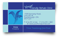
Business Card
A double sided business card, also used as an appointment card.
RETURN ADDRESS LABEL
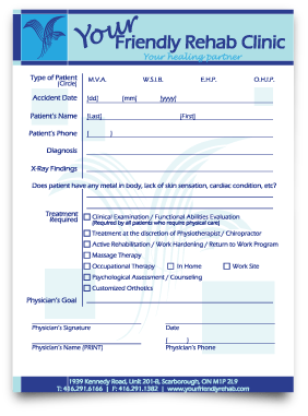
REQUISITION FORM
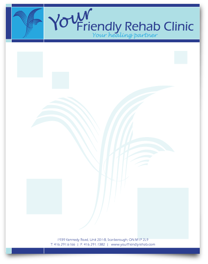
LETTERHEAD
Marketing Material
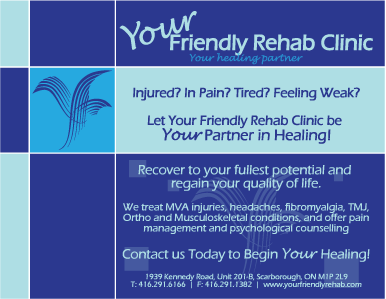
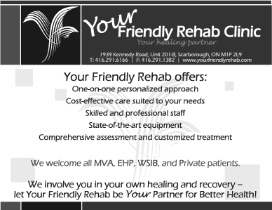
Postcards
4″ x 6″, double sided postcards to market their vast services were a successful and economical option.
Testimonial
“We are very happy with all the design work Hire Minds Inc. did for us. It was a long process, and a lot of back and forth, but at the end we got what we wanted. Thank you for your patience with us, and for providing us with such amazing service!”
